LOC LUSH®
Loc Lush®, a company that produces canabidoil infused hair serum that promotes healthy hair growth.
SCOPE
Brand Design
Creative Direction
Art Direction
Packaging Design

Case study
PAIN POINT
Loc Lush® approached us at a time where they we ready for expansion. They had build a solid local customer base but felt their business and products had more potential to reach a wider audience. The goal for this product was to give the brand a refresh. Their product was a new concept to the market so it was imperative to really tell their story in a visually impactful way that not only created transactional bonds, but transformational relations with their customers.
SOLUTION
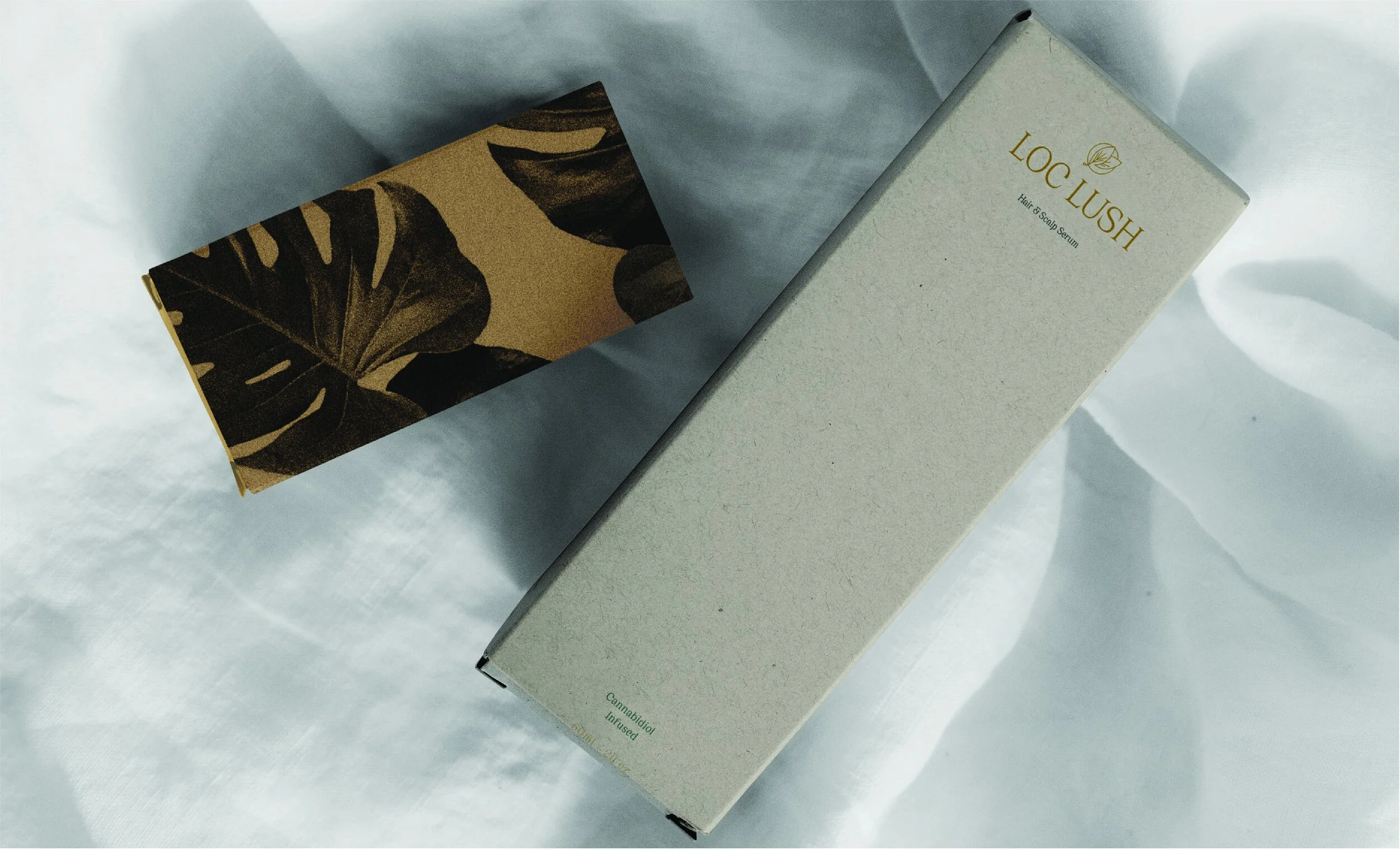
We wanted to capture the essence of the loc hair community – to take things back to the root of the hair style. We also wanted to destroy any negative stigmas surrounding cannabis infused products. The first thing we did was ensure the logo type created was elegant – the logo mark was created in the same vein. With cannabis being a plant, the challenge was to create a mark that it wasn’t stereotypically associated with, but still felt authenticate its origin.
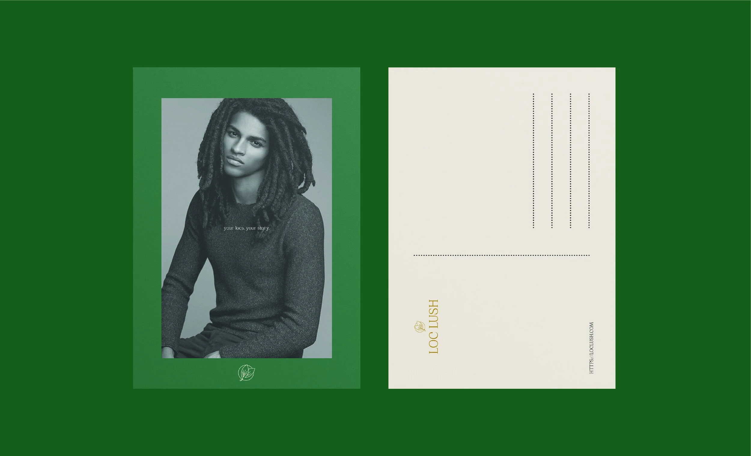
We chose forest green and other earthy tones to continue the narrative of nature and aligning with the root of not only the plant, but of one’s scalp. All accompanying assets were intentionally created to break stigma and create new conversations.
RESULTS
Loc Lush® has continued to expand their customer base. Their new visual identity has positioned them to connect with new customers and strengthen the relationships with their current base.
Assest


