KÉ GUSTO?
Ké Gusto? Gelato Cafe offers a taste of Sicily with its traditional ice cream, churned to perfection.
SCOPE
Brand Design
Creative Direction
Naming
Art Direction
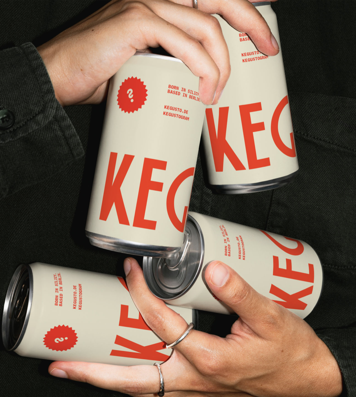
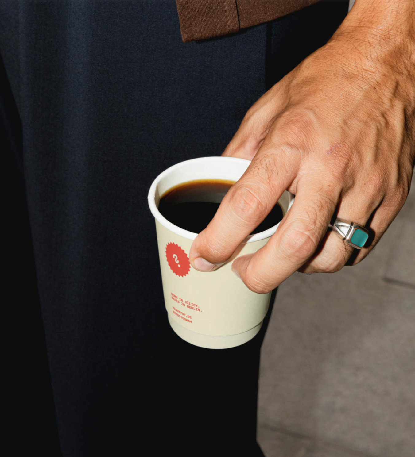
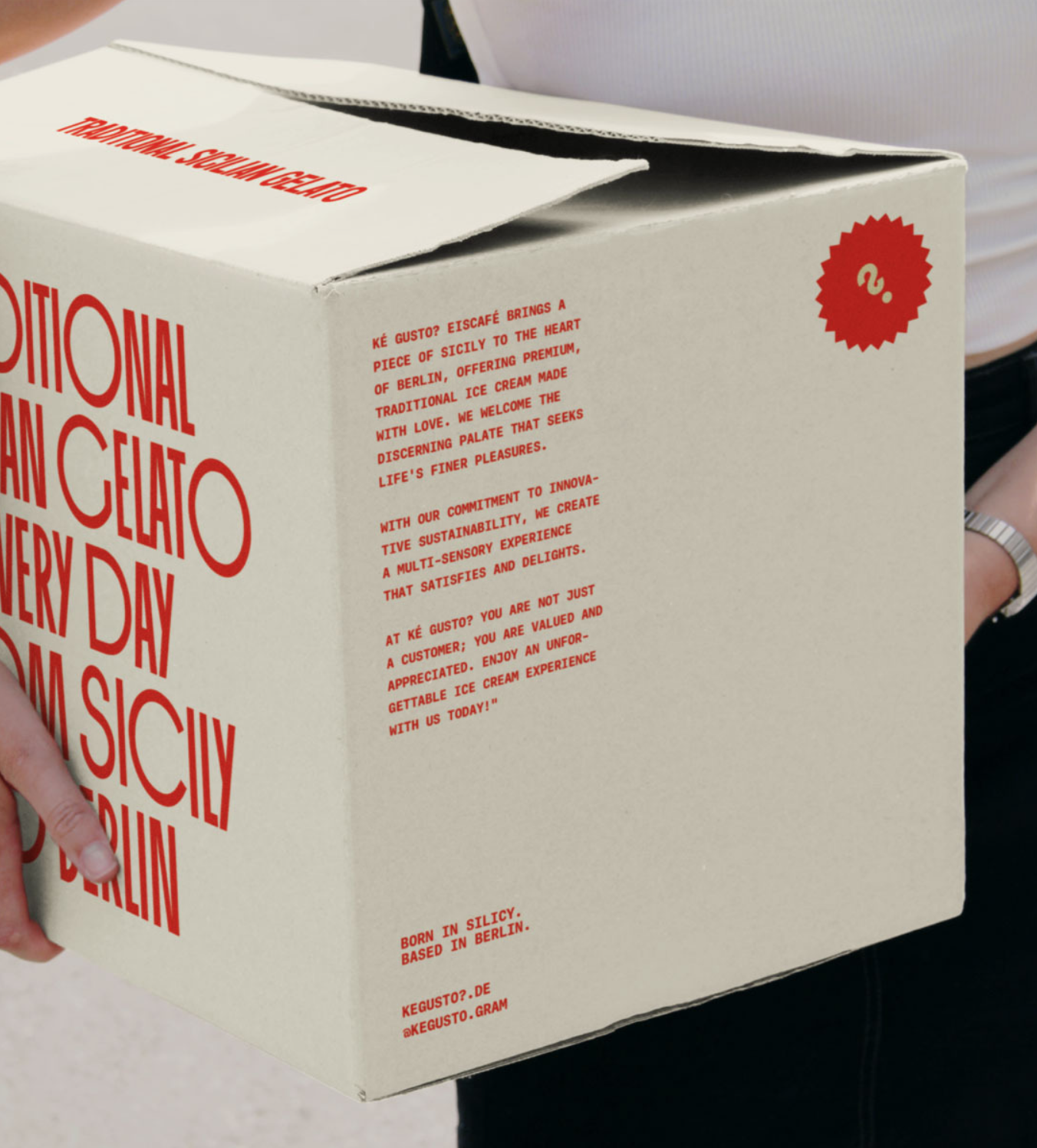
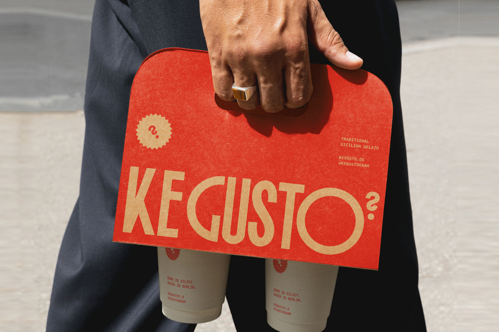
Packaging Design
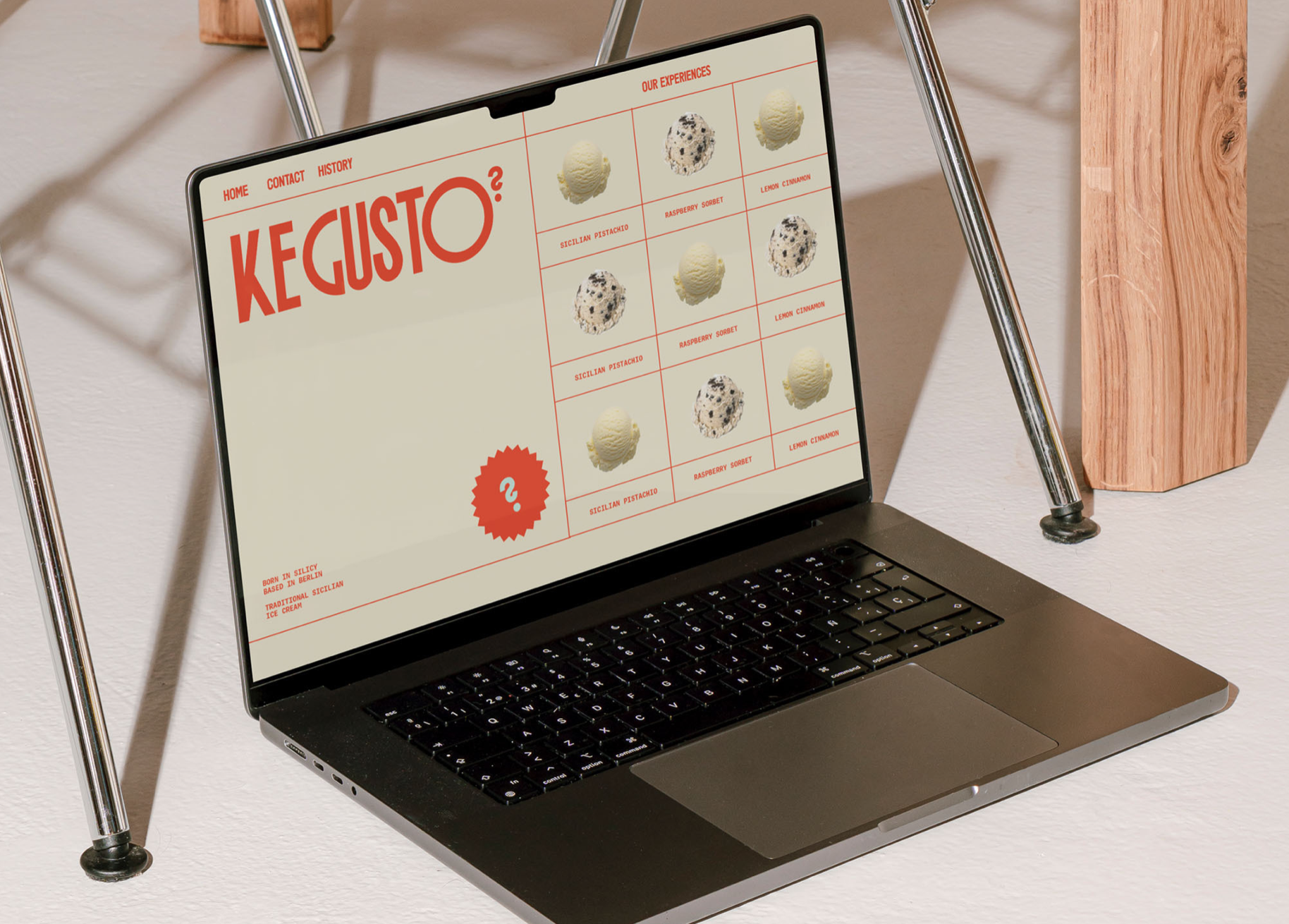
Web Design
Case study
Ké Gusto is a concept Sicilian ice cream brand for gelato and coffee enthusiasts.
PAIN POINT
SOLUTION
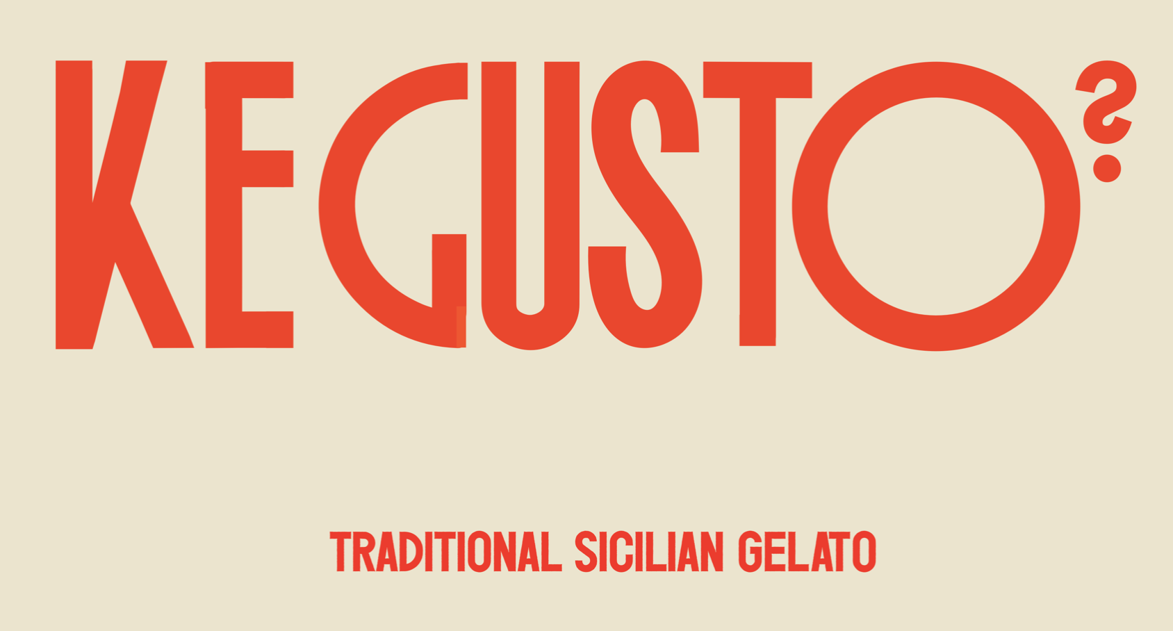
The name – which translates to ‘Which flavour?’ and sets the tone for the brand. The first idea was choosing typography over a graphic symbol, as it offers a more impactful and timeless way of conveying the visual message encapsulating the brand’s Italian essence. This decision is rooted in the belief that typography not only avoids rapid dating, but also carries a deeper and more enduring visual significance, aligning perfectly with the brand narrative.
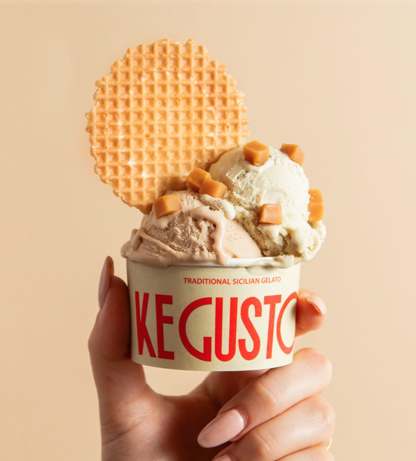
The sense of balance in the wordmark was achieved with a bit of tweaking, as it involved an amalgamation of distinct typefaces, interwoven to ensure a seamless harmony across the letterforms. We deliberately extended certain letters, particularly the ‘O’ and the ‘G,’ to not only add a contemporary twist to the traditional Italian typographic style, but also heighten the visual impact. In fact, this tension between tradition and modernity became a running theme throughout the creative process.
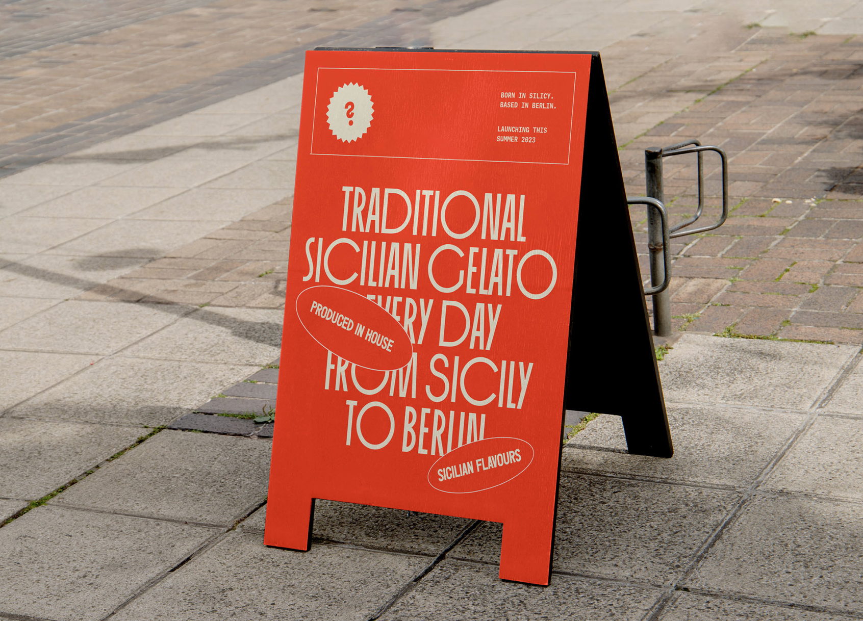
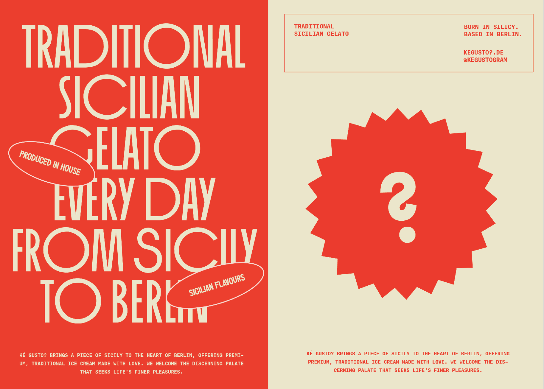
The visual pull away from convention is reflected in the deliberate modification of the typically robust vertical strokes of Roman characters, now rendered thin, while the traditionally slender horizontal strokes have been accentuated in thickness. We also extracted the question mark from the wordmark to create a recognisable brand symbol, and smattered it across menus, packaging and communication assets.
To support the dramatic contours of the wordmark, we chose Adelle Mono as the secondary typeface, used for the supporting text. The typewriter style of the typeface harmoniously complements the primary type, offering an enhanced and balanced visual appeal. To also set Ké Gusto apart from other ice creameries, washed in pastel tones, we chose a punchy orange, color blocked with a soft beige, which along with the stand-out look of the wordmark, adds to the au courant spirit of the brand.
RESULTS
N/A
Assets

