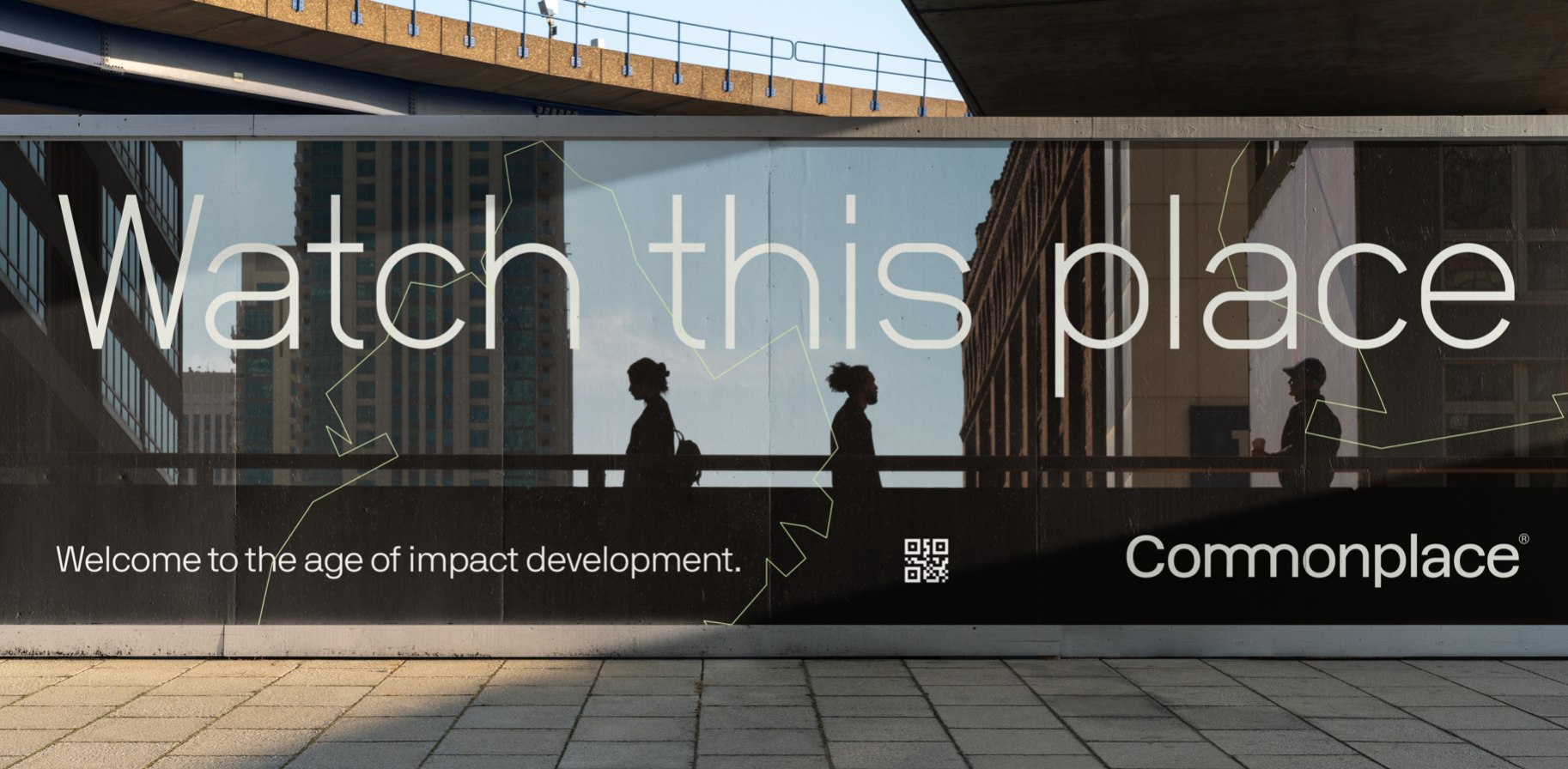
COMMONPLACE®
Commonplace® is a real estate development company with the mission of making real estate development more equitable, inclusive and sustainable.
SCOPE
Brand Design
Creative Direction
Art Direction
Naming
Case study
PAIN POINT
When we first met the team behind Commonplace, they were known as REDIST, and were focused on building a property tech platform to help developers access public financing. But their vision was so much bigger – nothing less than the transformation of real estate development to be more equitable, inclusive and sustainable. As a platform that connects developers and investors who share a mission to build for the social good, Commonplace was looking for a brand refresh to align with their new direction.
SOLUTION
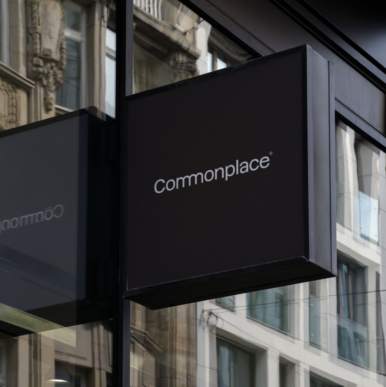
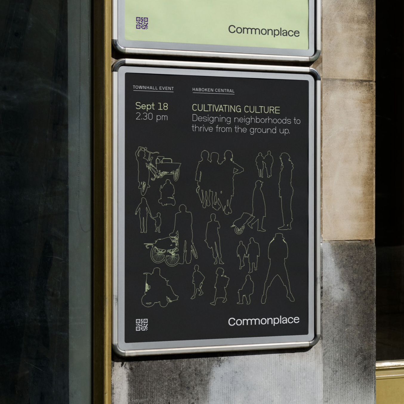
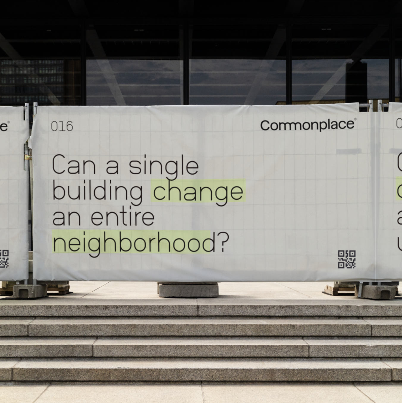
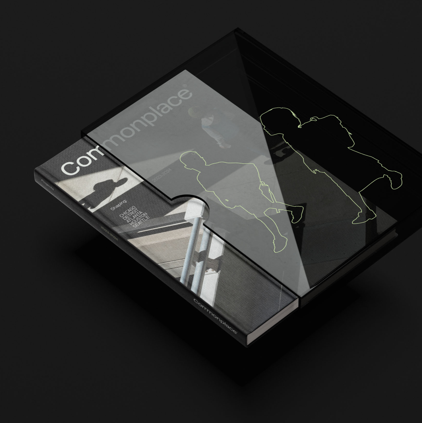
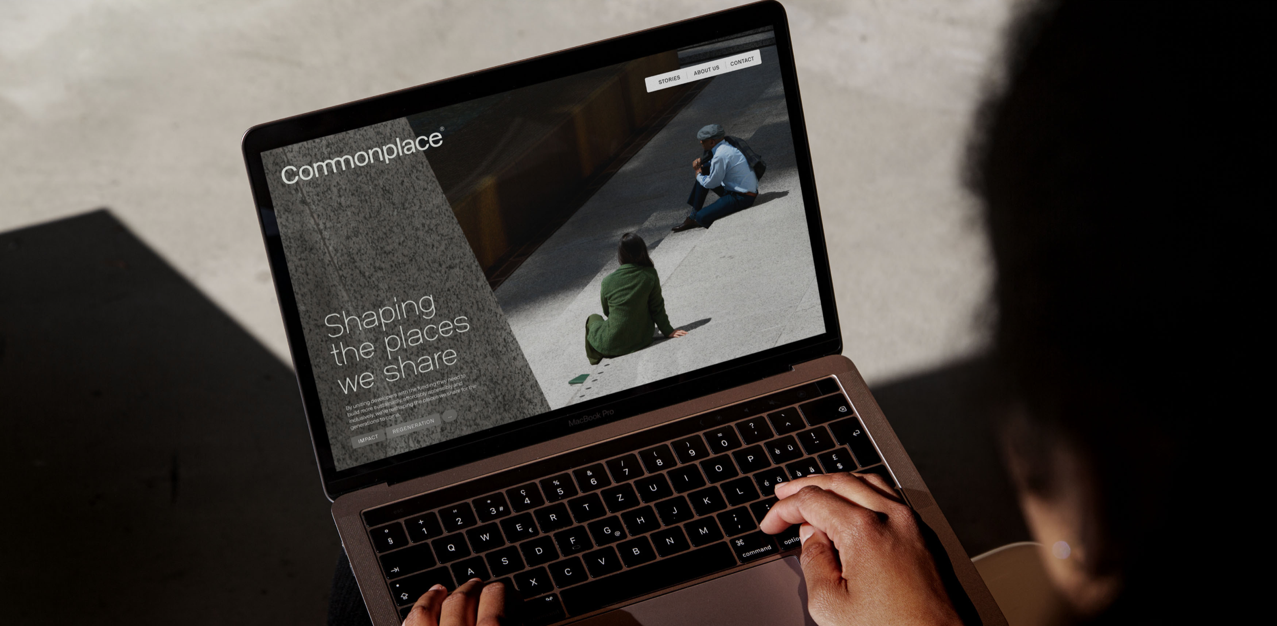
To usher in this new era for Commonplacewe led wit the word mark. In it, the two ‘m’s are interconnected, symbolizing not only collaboration, but the physical notion of a meeting place. Alongside subtle graphic nods to the architectural world – inspired by a continuous enquiry into how we interact with the built spaces around us – the placement of typography was deliberately ‘contained’ to naturally complement the negative space.
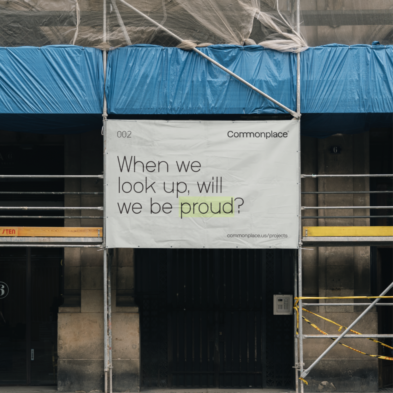
From the very get-go, he leaned towards the architectural qualities of Berlin-based Neubau’s typefaces, which proved to be a perfect fit for the subject matter – the built environment. NB Grotesk offered the unique ‘second glance’ quality to elevate our primary headlines, while NB International works as a slightly more restrained, yet timeless family that can robustly support the editorial side of the brand. It is this orchestrated coming together of various elements that create a quiet, yet impactful universe for Commonplace.
Assets
