Brand Overview

We bridge the gap between brands and their customers by telling unique brand stories in a compelling, engaging, and culturally impactful way.
WE ARE CNCT®
CNCT® is an innovative strategic branding studio specializing in multi-disciplinary creative solutions. As a human connection company, we bridge the gap between your brand and your customers to solve complex problems by telling your company’s unique story in a compelling, engaging, and culturally impactful way that only your brand can articulate to build deeper connec- tions that transcend transactional bonds and creates long term transformative relationships.
At CNCT®, we firmly believe innovation is a community journey. We are on a mission to tell the greatest brand stories ever told by partnering with the most innovative and forward thinking businesses and activators in the world.
The foundation for everything that we do is rooted in service. We do our best to ensure we are exhausting all of our resources, abilities, and experiences to help you achieve your business and branding goals. We recognize that at the end of the day, doing great work is all that matters. Great ideas mean nothing without great execution. If we do nothing else, we will exude maximum effort to ensure your brand becomes the disruptor it’s meant to be.
OUR SUPERPOWERS
We help create brands with disruptive ideas, innovation, and a childlike imagination.
We create disruptive brands that are highly effective at boosting revenue, increasing brand equity, and improving ROI. Our big picture approach powers your entire business, not just the marketing department.
OUR SUPERPOWERS
• Discovering unique market positioning • Brand Strategy
• Brand Identity
• Brand Activation
The connection between culture and humanity,
CASE STUDIES
CASE STUDIES
TARVER
CASE STUDIES
TARVER
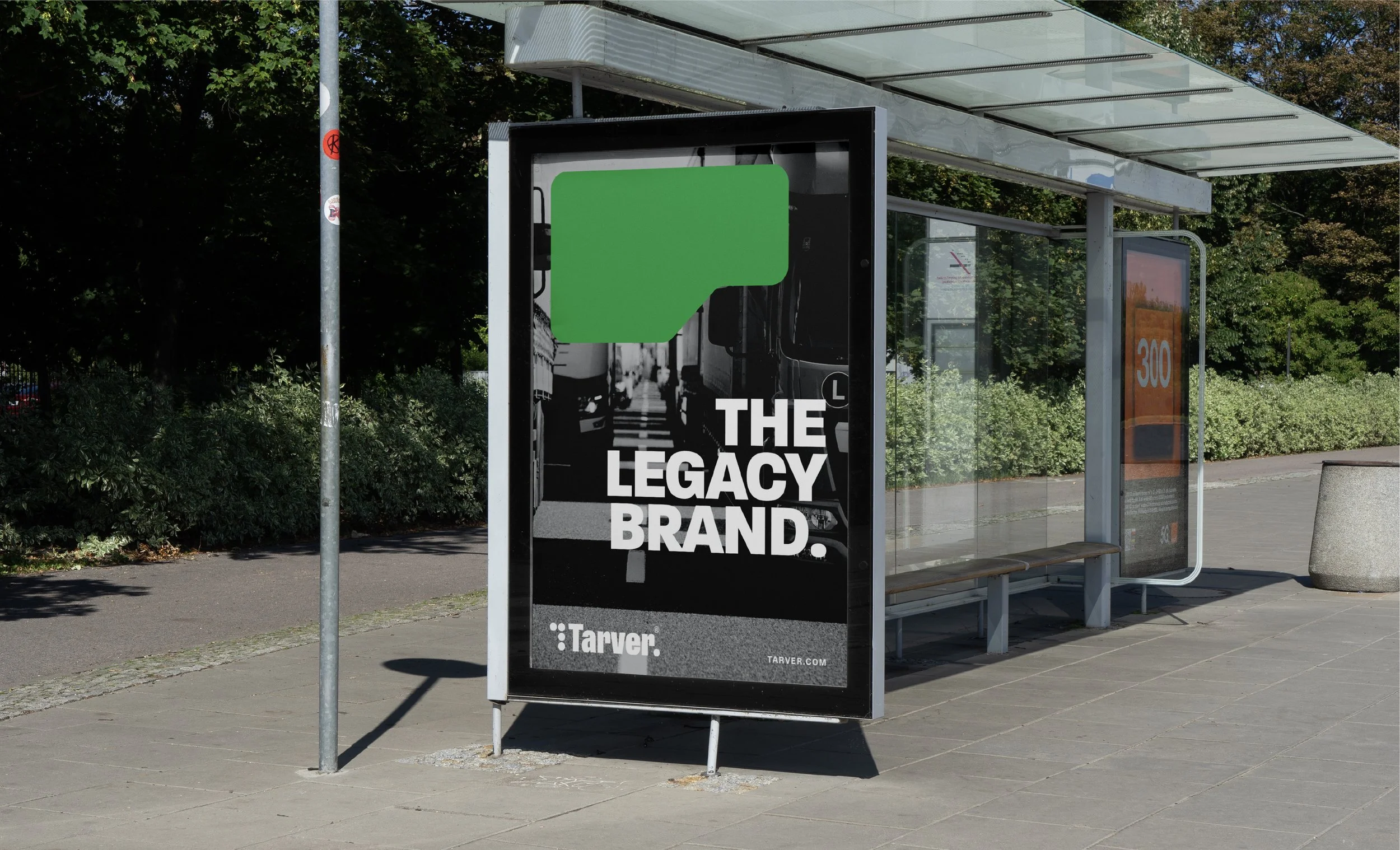
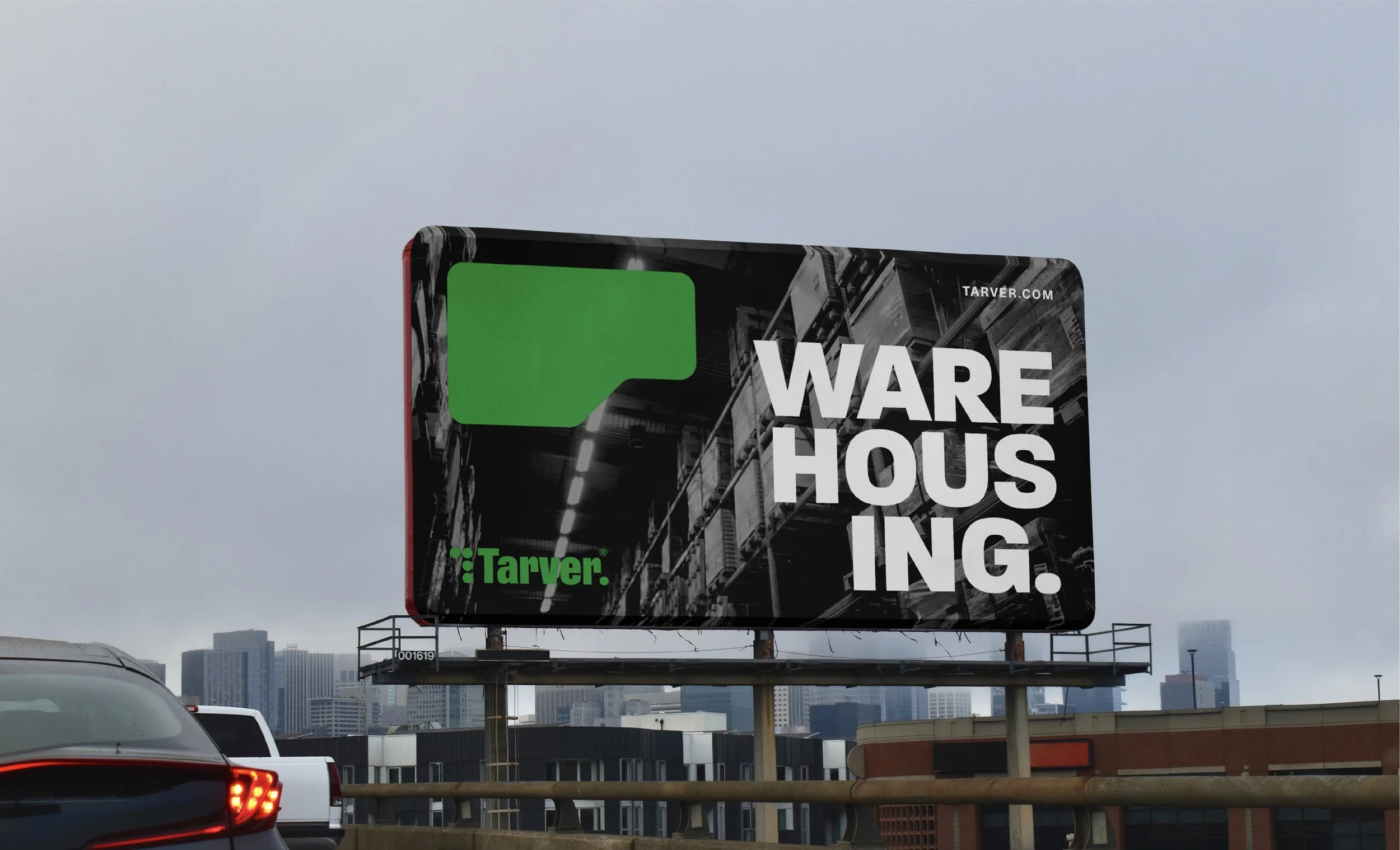
Tarver®, “The Legacy Brand”, is a logistics company out of Buffalo, NY building a legacy one day at a time.
• Brand Design
• Creative Direction
• Naming
SCOPE
Tarver®, formerly known as, People First Logistics Company, is a start up logistics company with a founder and company looking for a true identity and a pathway to its next steps in its growth process.
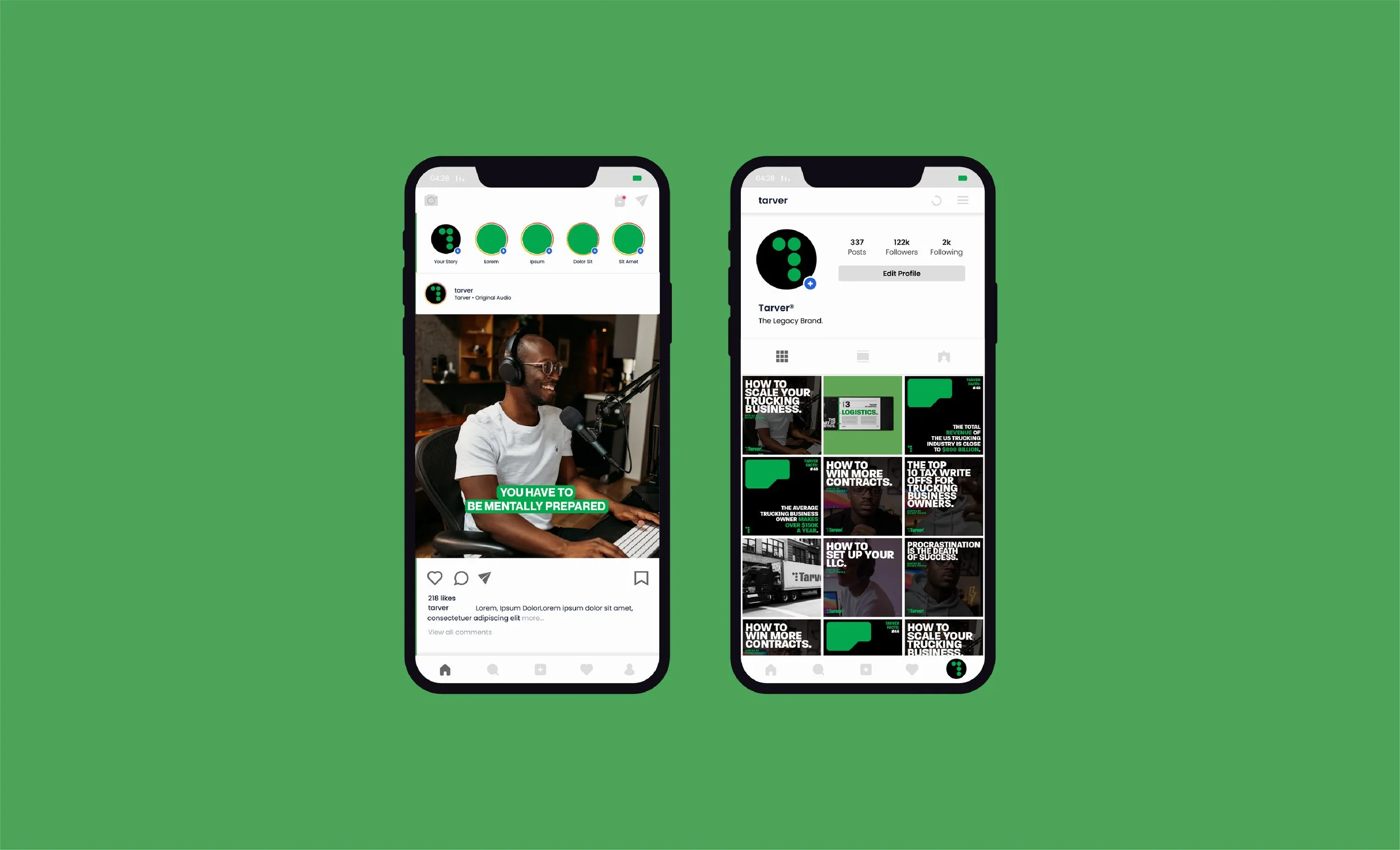
The company not only wanted to be a major player in the logistics field, but it also wanted to be a platform for current and aspiring trucking business owners by creating educational resources and content .
PAIN POINT
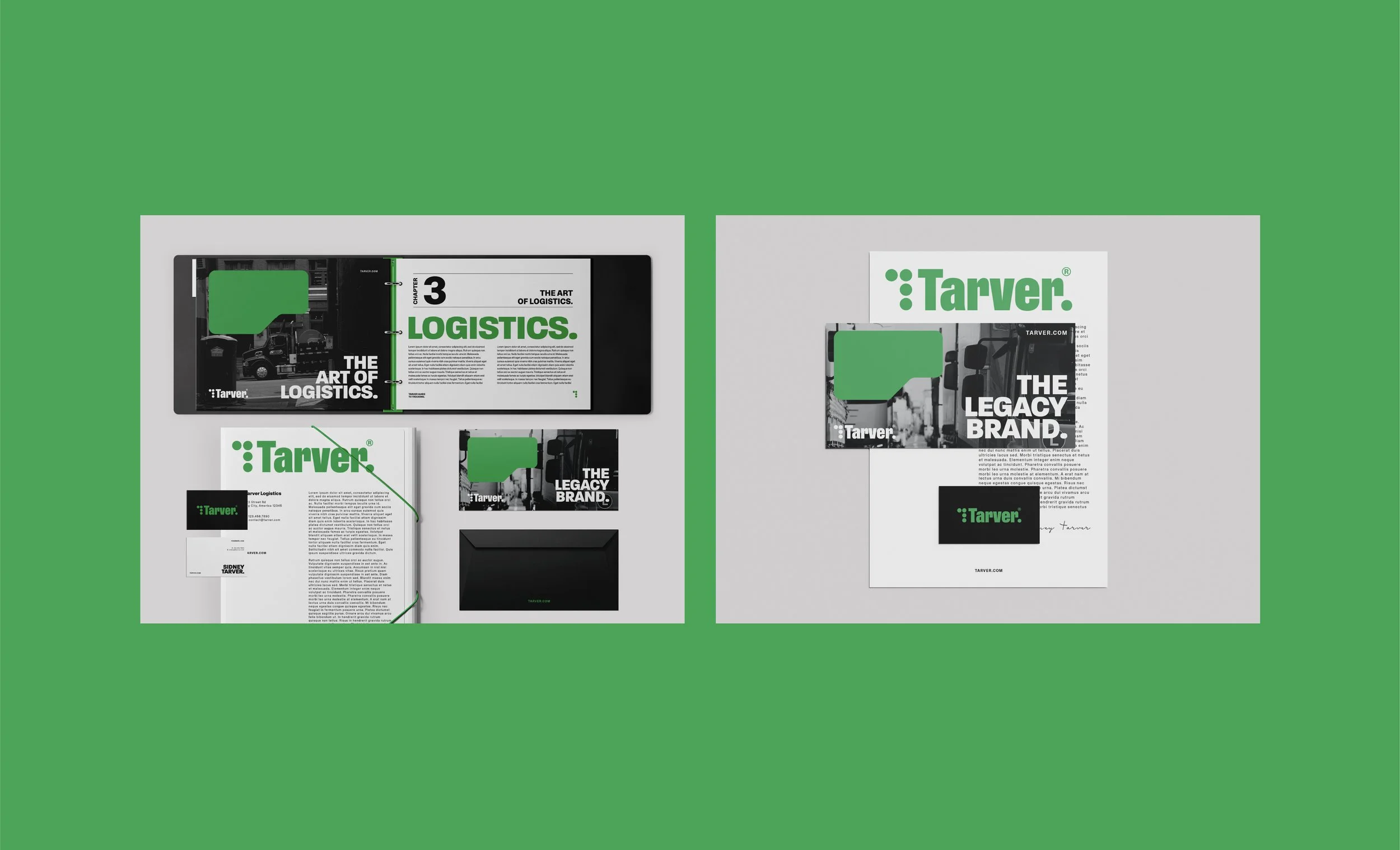
We crafted a brand identity system that truly aligned with the vision of the founder. And that started with changing the name of the company to Tarver® to embody the spirit of its founder, which was rooted in creating opportunities for others and helping others do the same.
With the word “legacy” being the north star to every decision made, we created a visual language that was disruptive to the status quo of the logistics industry. We wanted to create graphics that resonated wit ha new generation of entrepreneurs and customers. The design had to be youthful enough to speak to a younger generation, yet, mature enough to have a voice at the current table.
We also wanted to keep the legacy of people first, so we made sure to use images of real working people, in real working environments, displaying real human emotions. We wanted this brand identity to not only be appealing, but to connect with people in a real way and that positioned the brand for continued growth.
SOLUTION
SMART CITY LOCATING
CASE STUDIES
SMART CITY LOCATING
CASE STUDIES
Smart City Locating®, a national apartment location service, disrupting the apartment search business.
• Brand Design
• Creative Direction
• Art Direction
SCOPE
Smart City approached us as they were going through a major shift in their company’s journey. The company was in business six years at the time and had a company valuation of about $25million. They had operations in Dallas, Houston, and Austin, TX, they officially established key positions within their organization, and were ready to embark on national expansion. To top things off, they had over 200K followers across all of their Instagram accounts.
Their goal for this next phase was to become the most trusted, most referred, and most utilized resource among apartment renters in America
The missing link was having visual representation that positioned the company as a major player in the apartment locating industry. We were tasked with doing a complete brand identity overhaul that serviced their physical and digital needs, as well as served as a vehicle for growth and customer acquisition.
PAIN POINT
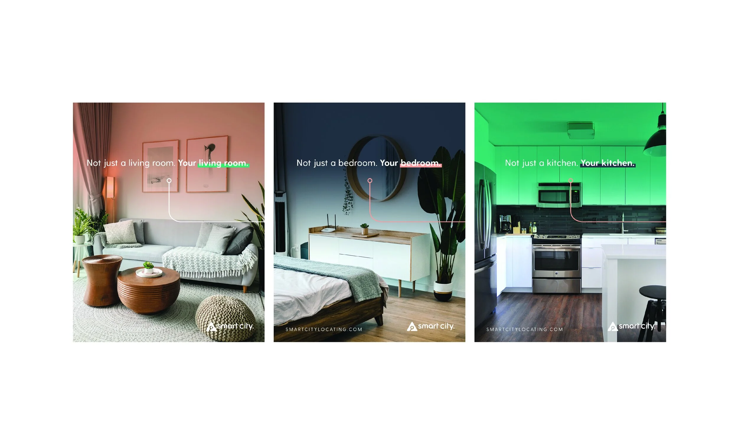
We crafted a cohesive corporate identity that truly reflected where the company was at the time, while not having any restrictions as to where the company was headed. The biggest change the company needed from its previous branding efforts was consistency and cleanliness. Previous assets didn’t seem to serve any purpose. There was no story being told. And there was nothing for customers to connect with outside of needing a place to live. With this being a market that was expanding at a rapid pace, it was imperative for Smart City to have a visual identity that was well thought out and consist across all tough points.
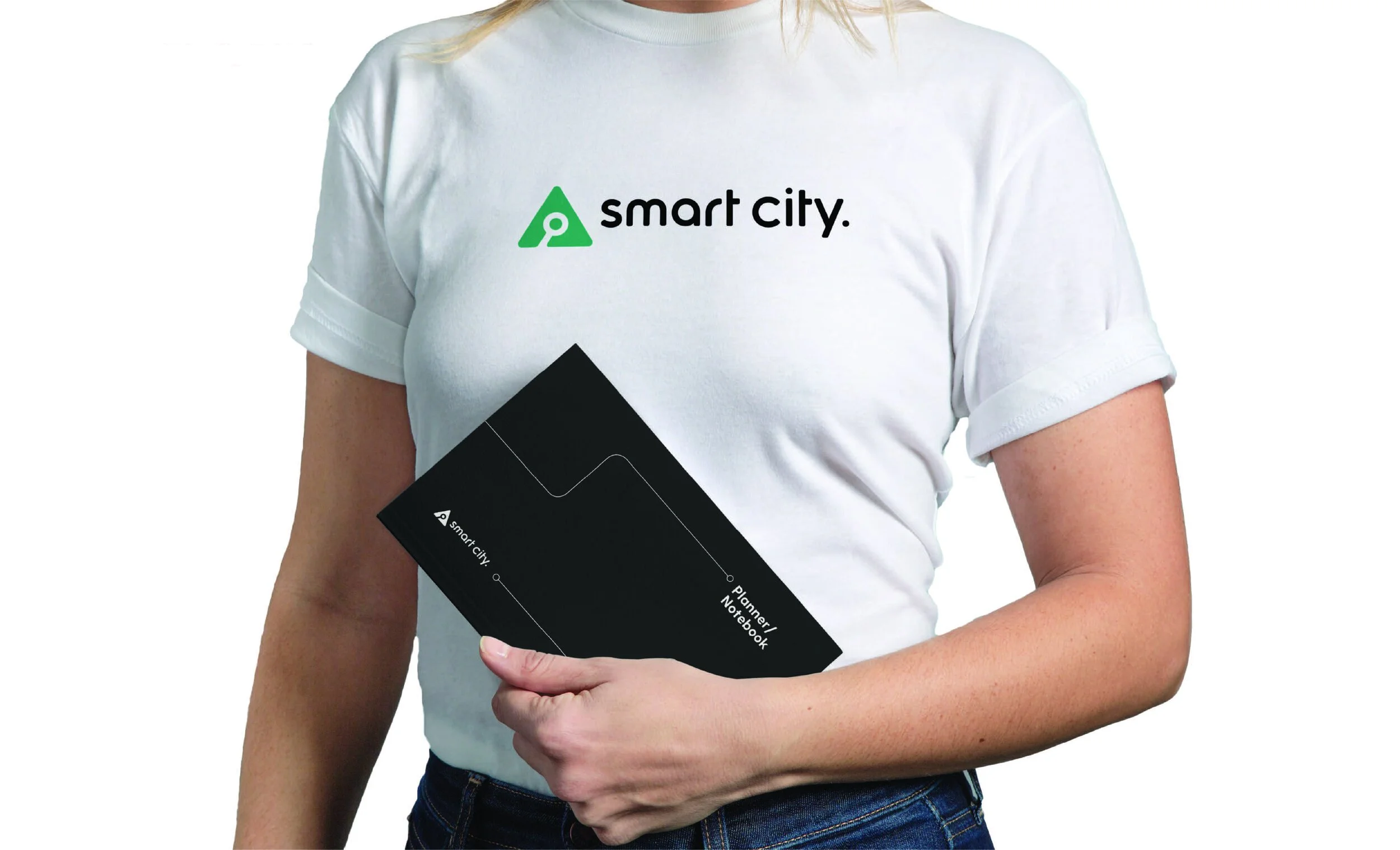
We used a minimal color system to make asset creation, whether digital or physical, super easy to execute. The logo serves as a search icon ,which is familiar across most websites, and a navigation arrow, which is common on most digital maps. We wanted to position Smart City as your ultimate search partner for your apartment locating needs and the logo speaks to that effort.
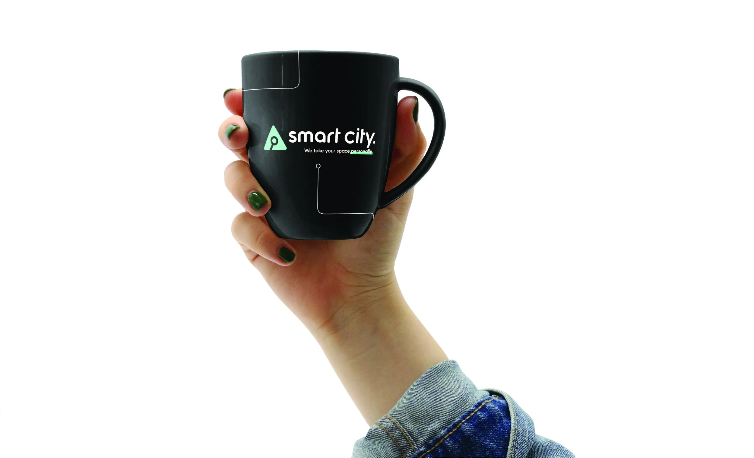
We landed the tagline, “We take your space personally”, because Smart City truly embeds themselves in the process when helping their clients. Smart City’s agents ensure their customers find the
apartment of their dreams as if it were their own so we needed to make sure the foundation on which everything in the company is done was fitting.
Sticking with the theme of navigation, we subtly used navigational guide elements across accompanying assets, which all lead the viewer to a destination.
SOLUTION
Since out engagement, Smart City Locating® has expanded operations to eight cities including, Atlanta, Chicago, Fort Worth, and Denver. Across all Instagram accounts they have amassed over 450K followers.
RESULTS
FITSOL
CASE STUDIES
FITSOL
CASE STUDIES
Fitsole® is a sneaker and lifestyle brand based out of Cairo, Egypt.
• Brand Strategy
• Creative Direction
SCOPE
Fitsole® approached us to assist in their global brand relaunch. From the streets of Cairo, to the burroughs of New York, Fitsole® was ready for a global takeover and needed a visual identity that was authentic and represented its aspirations.
PAIN POINT
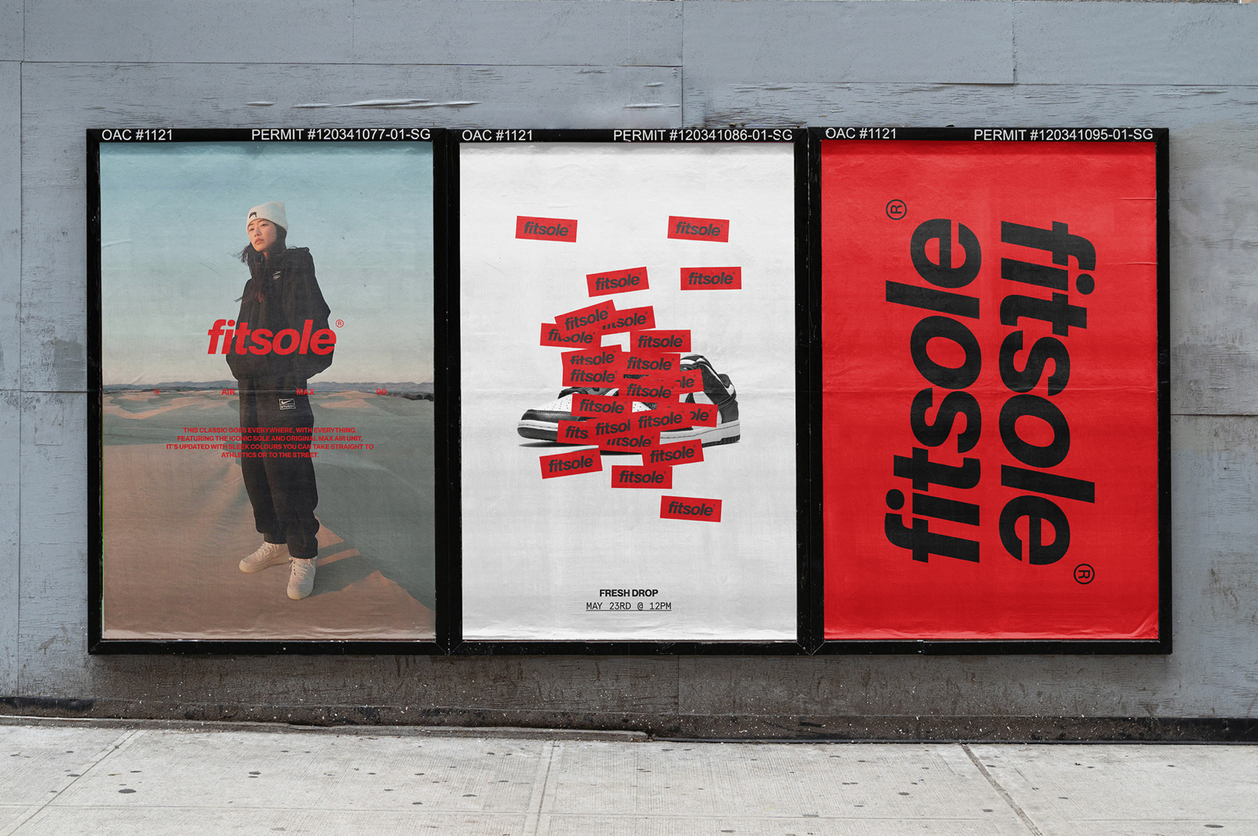
An important task of this project for us was sticking to Fitsole’s streetwear roots. A clever, crucial element of the brand’s identity was the sticker design. We wanted customers to have the ability to ‘tag’ their favorite items – a nod to Fitsole’s roots in street culture, tagging and graffiti.
As a retailer that pools together the best sneakers and apparel from leading brands, Fitsole needed an identity that would capture their DNA, but also make space for the suite of brands they stock. Walking this delicate tightrope, we delivered a sans serif, all-lowercase word mark set in Neue Montreal, that allows for a sense of “accessibility and authenticity,”. From the very get-go, one thing was clear – the identity had to reflect Fitsole’s global output.
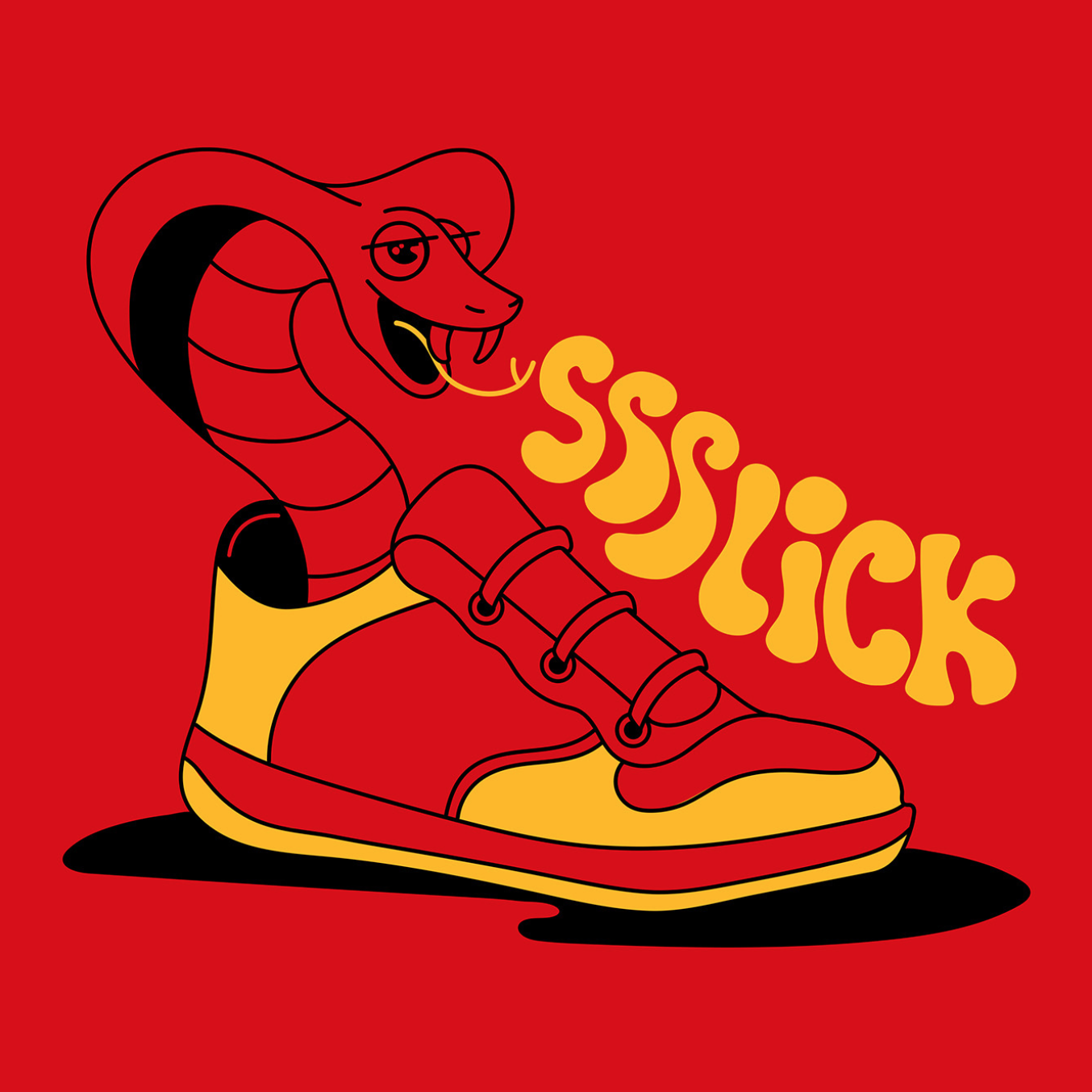
Our strategic insights showed that the market in this area had a bit of a problem with products not being authentic, but rather counterfeit. We carried this over into our design thinking and steered the design system not toward Egyptian heritage, but rather towards elevating the brand to be seen as a credible retailer, stocking authentic, top-shelf products, with a global vision of creating a collective and culture of like-minded sneaker heads. However, the Egyptian-ness of the brand is felt in other elements – from the color palette, that leads with the rich red of the national flag, to the illustrations on the stickers, that aim to infuse Egyptian history and even challenge certain stereotypes. The illustrations feature imaginative settings – from a snake rising from a sneaker in a trance-like state, to a camel confidently skateboarding through the bustling city streets while sporting a pair of sneakers.
SOLUTION

A HUMAN CONNECTION COMPANY™
One of our greatest superpowers
is strategic storytelling. Helping brands create strong relationships with the congregation they serve.
Julian Sample
FOUNDER | CHIEF BRAND ARCHITECT


